The time has come; the old website has got to go. You hate it, the attendees hate it, the boss hates it, and even your mother hates it, and she doesn’t even own a computer. The damn thing is not very functional and looks like it was created somewhere between 1973 and 1999, and just like an old broken down old car, it costs you a boatload of money just to keep it going. Money that would be better spent on speakers, venues, and booze.
Getting ready to create a new conference or event website is not actually the pain in the ass that many people would make it out to be. With a bit of planning, the experience can be quite pleasant in a “you just got your teeth cleaned” kind of way. You know, it sucks at the beginning, but it is amazingly awesome at the end.
Before you begin any web project, you need to know where it will end up. You need to get a good idea of what styles you like and what you don’t; You need to know what functionality is essential and which is worthless. You need to imagine what you want the finished product to be.
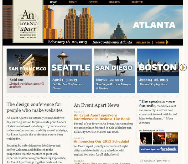
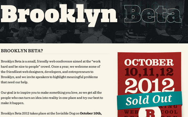
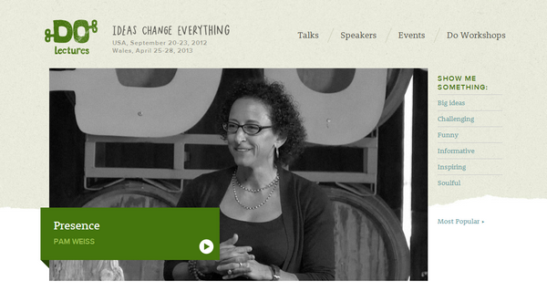
To get you thinking about the end game, here are some designs to inspire and motivate. Have a look and actually click through because, in some cases, the picture does not tell the complete story of what your new conference site can be. Remember, your website is the first experience many attendees will have with your event, so it pays to make a good first impression.
ACRP 2013

The Brand New Conference

An Event Apart
Brooklyn Beta
Do Lectures
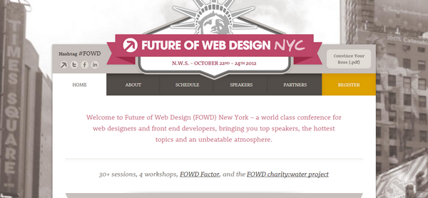
Future of Web Design New York
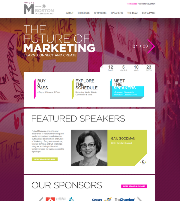
Future M
Society for Human Resource Management

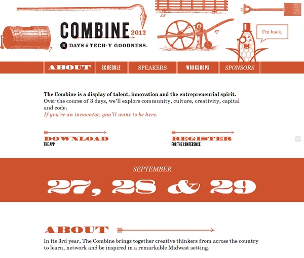
The Combine 2012
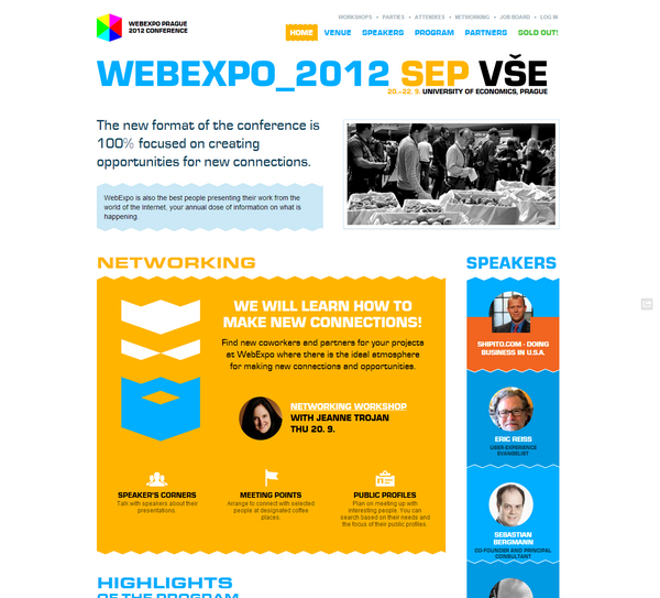
Web Expo Prague
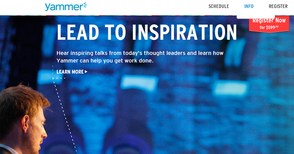
YamJam
Dreamforce 12


